︎︎︎ Back
2019 – Blueland


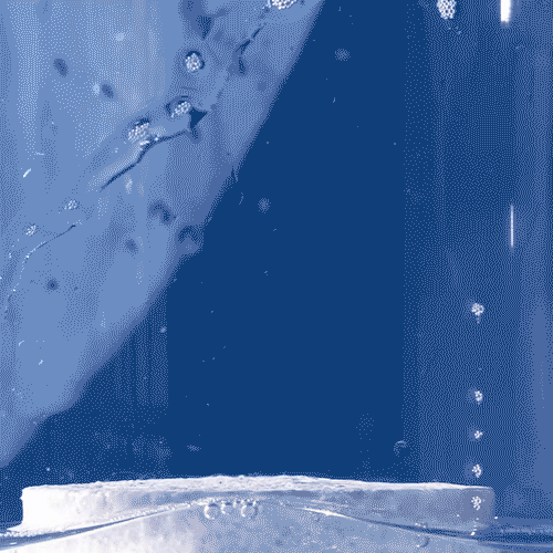


Brand identity, creative direction and strategy for Blueland’s first iteration, sitting nicely at the intersection of science, sustainability and cleaning.
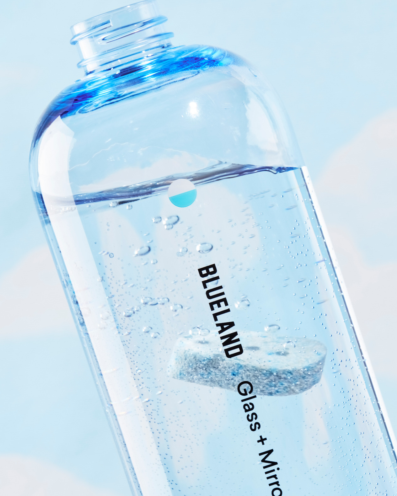
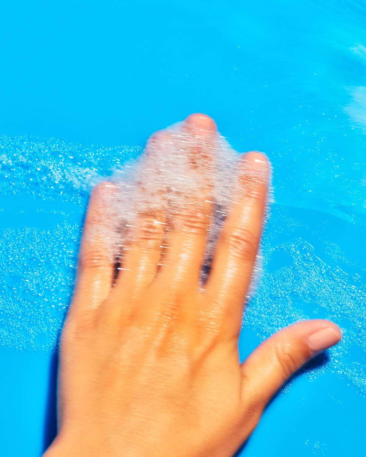
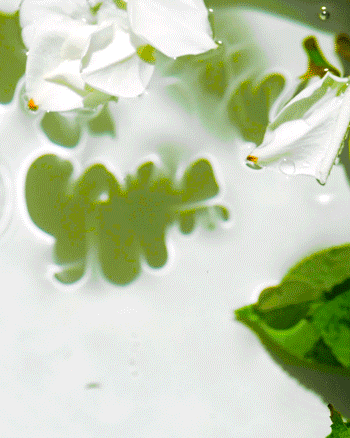
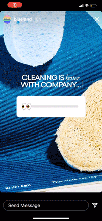
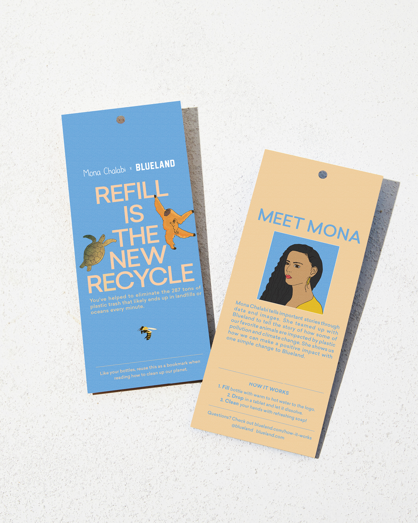
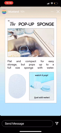
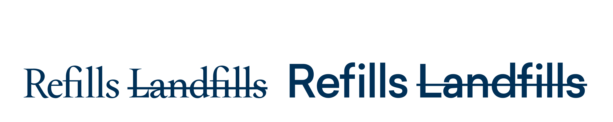
As we introduced ourselves to the world, we needed to double down on education around the innovative cleaning tablets. This also re-inforced blueland’s one-of-a-kind product that pioneered the refill movement. We wanted to infuse our visuals with feelins of being awaken, energized with a slight hint of magical.
- Brand Identity
-
Creative Direction
- Design Direction

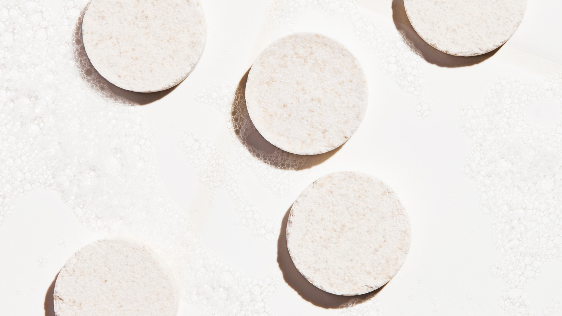

We introduced a versatile typographic system, robust color pallets and striking science-leaning visuals to elevate the cleaning category.

Channels & mediums:
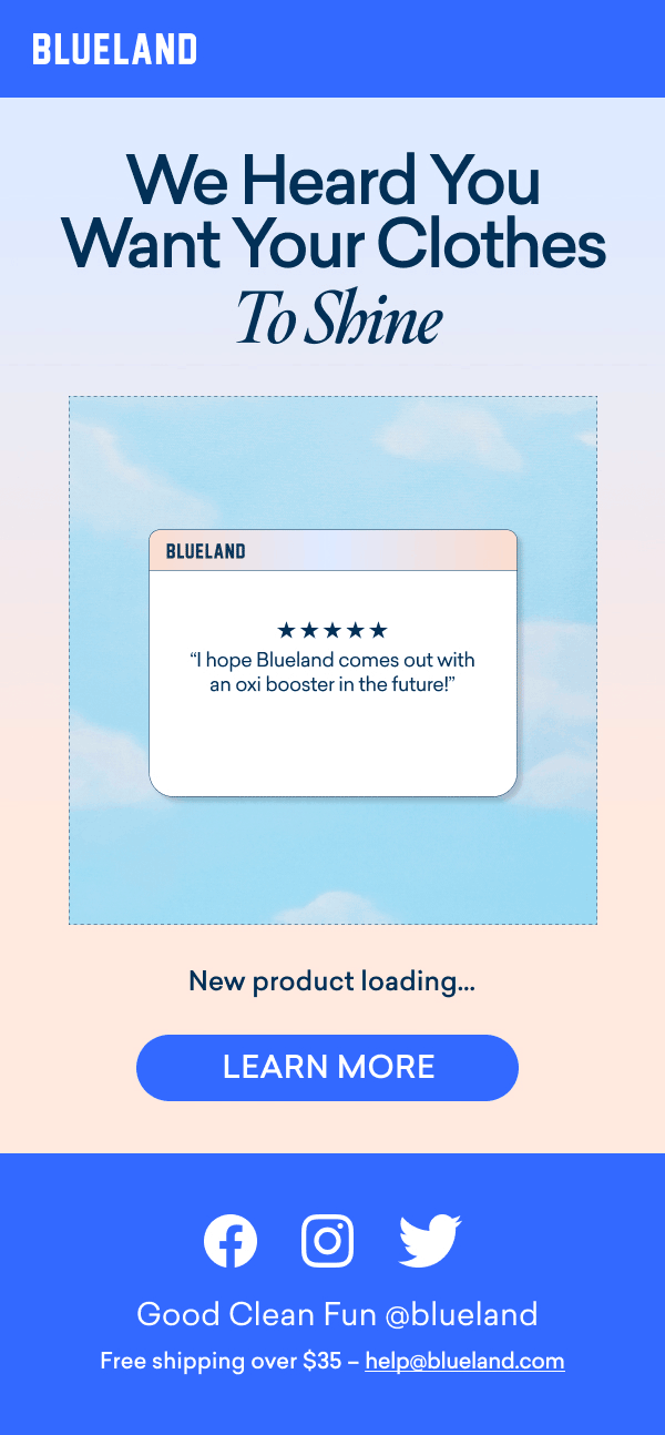
Physical product, packaging, website, social, print, video, email marketing, content and beyond.